iOS App Icon Colors in the Year 2015
It’s the end of 2015, and the iOS app store has been around for 7 years. There’s been several posts aggregating the color distributions of app icons since iOS 7 was released 2 years ago. 2 major iOS versions later, I figure it’s a good time to look at the app store again.
Methodology
I wrote a couple of Ruby scripts and pulled charts from the iOS US app store using RSS feeds from Apple, downloaded the icons and extracted the primary colors used in each icon. I then wrote a Mac app to generate the numbers, charts and tables. The Newsstand category includes apps from several charts and did not have a separate paid app chart so while I have included the data for completeness sake, I wouldn’t be looking at it.
I extract the primary color from each icon and put them loosely into one of these color groups: red, green, blue, black, white and gray. If they are identified as black, white and gray, I look at their secondary color and try to place them into red, green, blue instead where possible (e.g a small, single blue letter on a white background might work better if it’s classified as blue instead of white).
The app icons for each chart are then stacked vertically. The taller a column is, the more commonly that color is used for icons in that chart.
The data was pulled over several days from 16 Dec to 22 Dec 2015.
For the rest of this post, I’ll refer to the red, green and blue icon groups and ignore the black, white and gray groups.
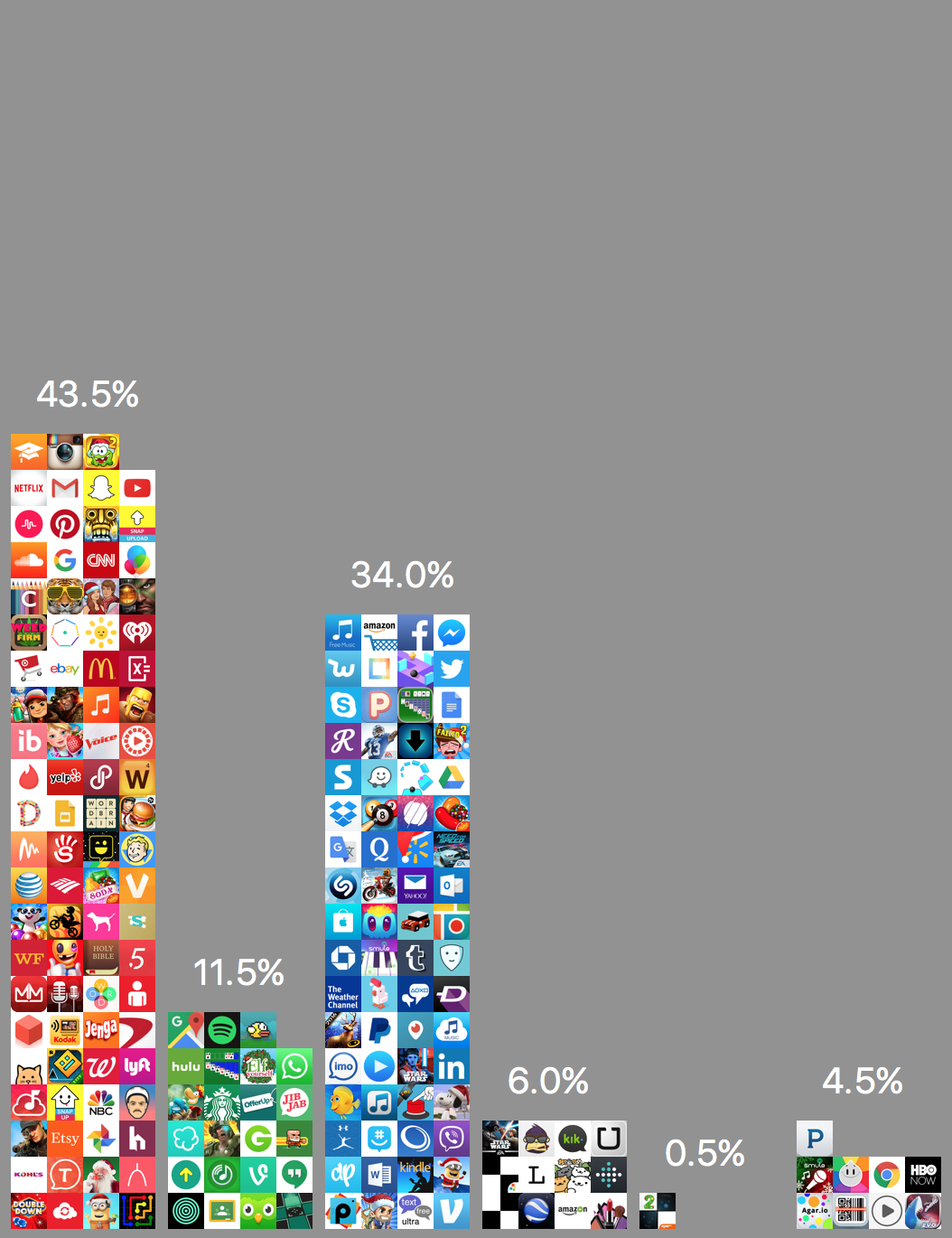
Icons of Top 200 Free Apps in the iOS App Store grouped into red, green, blue, black, white, gray
In the Top 200 Free apps chart, we can see that red app icons are most popular, representing 43.5% of app icons with green (11.5%) as the least popular.
Free vs. Paid

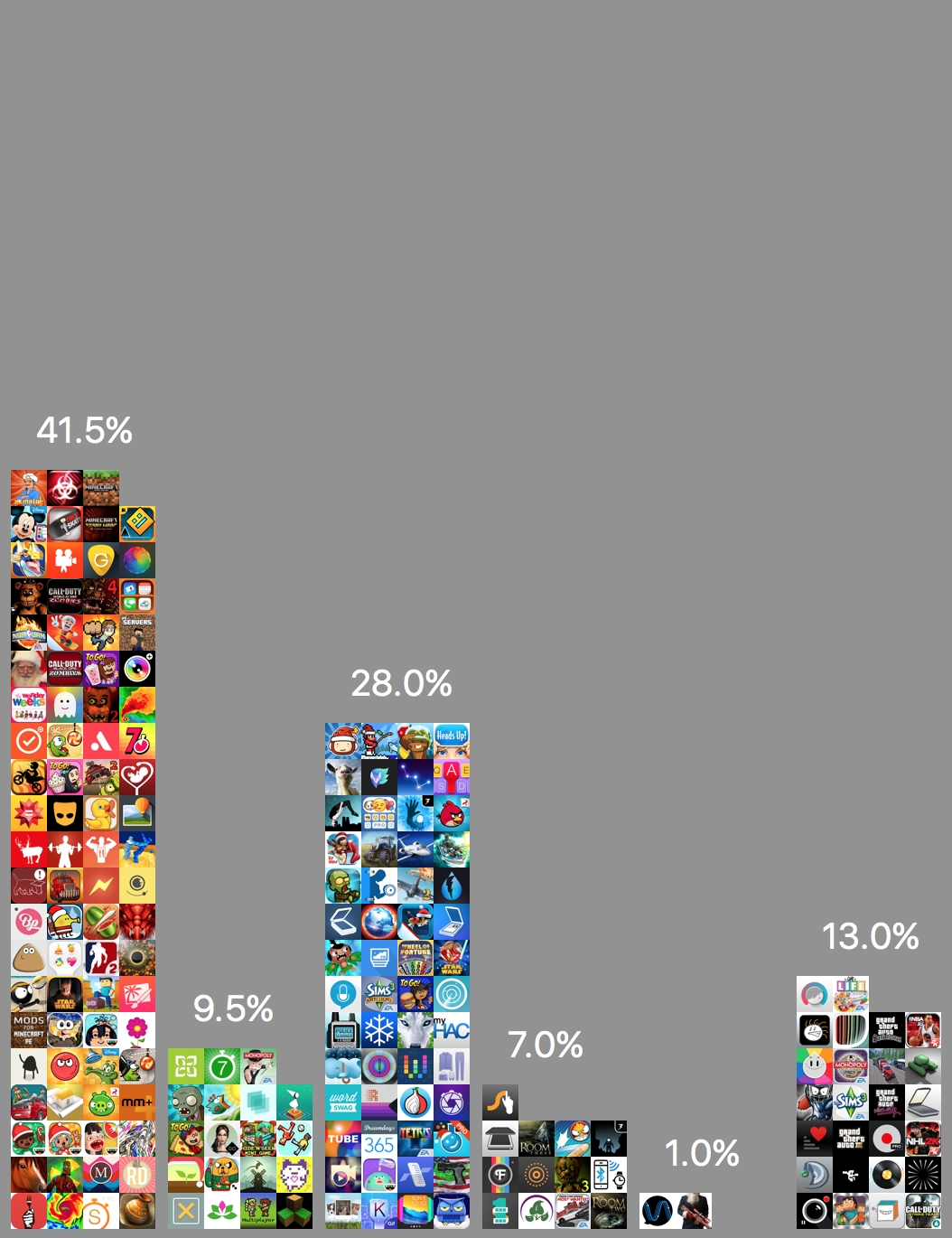
Top 200 Free (left) Apps vs. Top 200 Paid (right) Apps #
Eyeballing the Top 200 Free apps and Top 200 paid apps icons side by side, the distribution is similar.
Here’s the distributions in every chart for free and paid apps:
| Red | Green | Blue | White | Black | Gray | |
|---|---|---|---|---|---|---|
| All | 43.5 | 11.5 | 34.0 | 0.5 | 6.0 | 4.5 |
| Books | 49.5 | 13.5 | 24.5 | 1.0 | 5.5 | 6.0 |
| Business | 31.5 | 12.5 | 43.0 | 0.5 | 5.0 | 7.5 |
| Catalogs | 54.0 | 9.0 | 18.5 | 0.0 | 10.5 | 8.0 |
| Education | 38.0 | 18.0 | 35.0 | 0.0 | 5.5 | 3.5 |
| Entertainment | 42.0 | 13.0 | 30.5 | 0.0 | 4.5 | 10.0 |
| Finance | 27.5 | 20.0 | 44.0 | 0.5 | 4.0 | 4.0 |
| Food & Drink | 63.0 | 13.5 | 10.5 | 0.5 | 3.0 | 9.5 |
| Games | 44.0 | 10.5 | 32.0 | 2.0 | 6.5 | 5.0 |
| Health & Fitness | 36.5 | 15.0 | 37.0 | 1.0 | 5.5 | 5.0 |
| Lifestyle | 46.5 | 9.5 | 25.5 | 1.5 | 7.0 | 10.0 |
| Medical | 32.5 | 14.0 | 45.0 | 0.0 | 4.0 | 4.5 |
| Music | 46.0 | 5.0 | 31.0 | 1.0 | 5.5 | 11.5 |
| Navigation | 18.0 | 18.5 | 39.5 | 0.5 | 6.5 | 17.0 |
| News | 31.5 | 4.0 | 47.0 | 1.5 | 10.0 | 6.0 |
| Newsstand | 39.5 | 8.0 | 21.5 | 2.0 | 9.0 | 20.0 |
| Photo & Video | 45.0 | 7.0 | 29.0 | 1.5 | 11.5 | 6.0 |
| Productivity | 28.5 | 10.5 | 48.0 | 0.0 | 6.0 | 7.0 |
| Reference | 42.5 | 17.5 | 28.5 | 0.5 | 5.0 | 6.0 |
| Shopping | 41.5 | 10.5 | 30.5 | 1.5 | 10.0 | 6.0 |
| Social Networking | 30.5 | 18.5 | 39.5 | 2.0 | 8.5 | 1.0 |
| Sports | 36.5 | 13.5 | 26.0 | 2.5 | 8.5 | 13.0 |
| Travel | 34.5 | 12.5 | 39.0 | 2.5 | 6.0 | 5.5 |
| Utilities | 34.5 | 12.0 | 30.0 | 1.0 | 6.0 | 16.5 |
| Weather | 23.5 | 4.5 | 59.0 | 0.5 | 6.0 | 6.5 |
| Red | Green | Blue | White | Black | Gray | |
|---|---|---|---|---|---|---|
| All | 41.5 | 9.5 | 28.0 | 1.0 | 7.0 | 13.0 |
| Books | 54.0 | 12.0 | 24.0 | 0.0 | 6.0 | 4.0 |
| Business | 26.0 | 12.0 | 41.0 | 0.5 | 8.5 | 12.0 |
| Catalogs | 47.5 | 9.0 | 22.5 | 0.5 | 10.0 | 10.5 |
| Education | 42.5 | 15.5 | 34.5 | 1.0 | 3.0 | 3.5 |
| Entertainment | 44.0 | 12.0 | 25.0 | 0.0 | 10.0 | 9.0 |
| Finance | 36.0 | 18.0 | 30.5 | 0.5 | 9.0 | 6.0 |
| Food & Drink | 55.5 | 18.0 | 16.5 | 1.0 | 4.0 | 5.0 |
| Games | 45.0 | 12.0 | 25.5 | 0.5 | 6.0 | 11.0 |
| Health & Fitness | 39.0 | 13.0 | 33.5 | 1.0 | 6.5 | 7.0 |
| Lifestyle | 45.0 | 9.0 | 28.5 | 0.5 | 8.0 | 9.0 |
| Medical | 36.0 | 10.0 | 40.0 | 0.5 | 7.0 | 6.5 |
| Music | 37.0 | 11.0 | 25.5 | 3.0 | 11.0 | 12.5 |
| Navigation | 21.0 | 19.5 | 38.5 | 3.0 | 7.5 | 10.5 |
| News | 31.0 | 7.5 | 30.0 | 0.5 | 8.0 | 23.0 |
| Newsstand | 41.1 | 10.0 | 22.2 | 1.1 | 6.7 | 18.9 |
| Photo & Video | 39.0 | 7.0 | 28.5 | 1.5 | 10.5 | 13.5 |
| Productivity | 33.5 | 12.0 | 38.5 | 1.5 | 6.5 | 8.0 |
| Reference | 37.0 | 9.5 | 34.5 | 1.0 | 7.0 | 11.0 |
| Shopping | 43.0 | 13.1 | 19.6 | 1.9 | 6.5 | 15.9 |
| Social Networking | 30.5 | 16.5 | 41.0 | 1.0 | 4.5 | 6.5 |
| Sports | 36.0 | 13.0 | 25.0 | 0.5 | 11.5 | 14.0 |
| Travel | 30.5 | 16.5 | 38.0 | 0.5 | 10.0 | 4.5 |
| Utilities | 28.5 | 12.0 | 35.0 | 1.0 | 8.5 | 15.0 |
| Weather | 24.5 | 9.5 | 52.0 | 0.5 | 4.0 | 9.5 |
Here’s a tiny version of the breakdown of every chart #:

Free Apps in Every Chart

Paid Apps in Every Chart
A Few Observations
There are more red icons than green or blue icons.
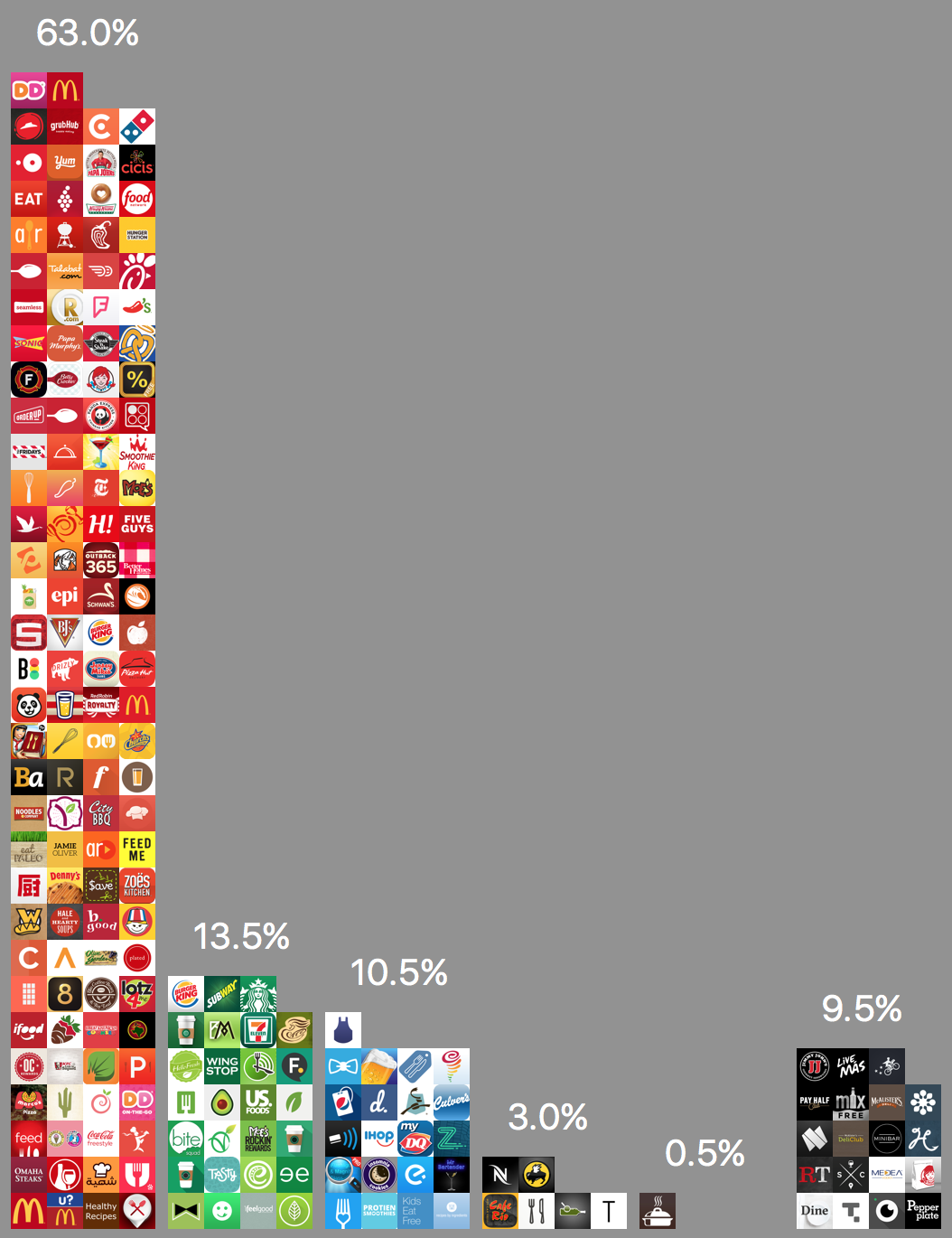
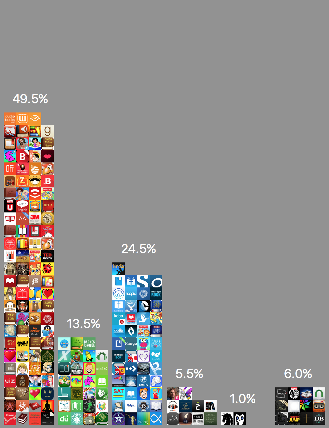
Free Apps in Food & Drink (left) and Books Charts (right) #
Food & Drink has the highest proportion of red icons followed by Books.
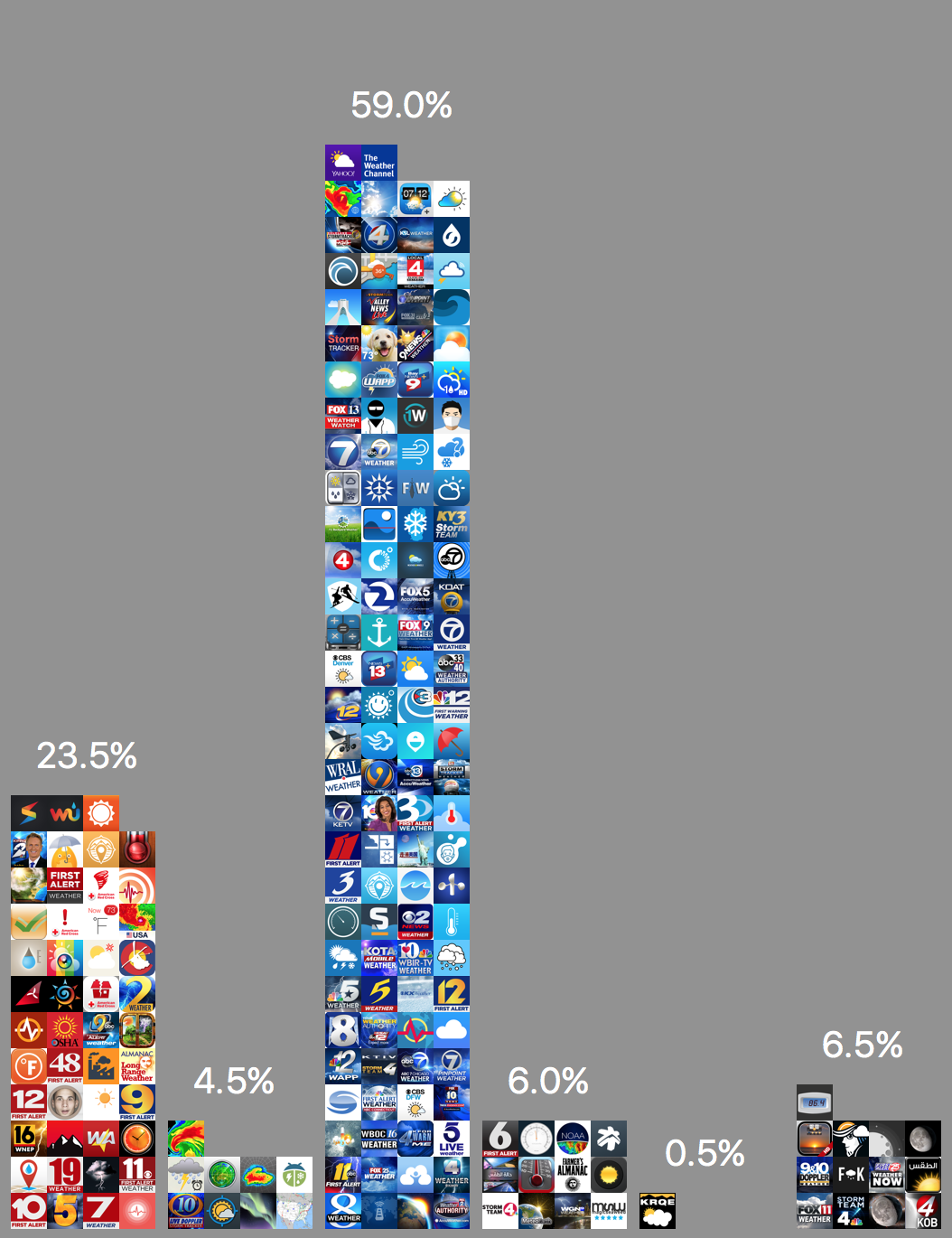
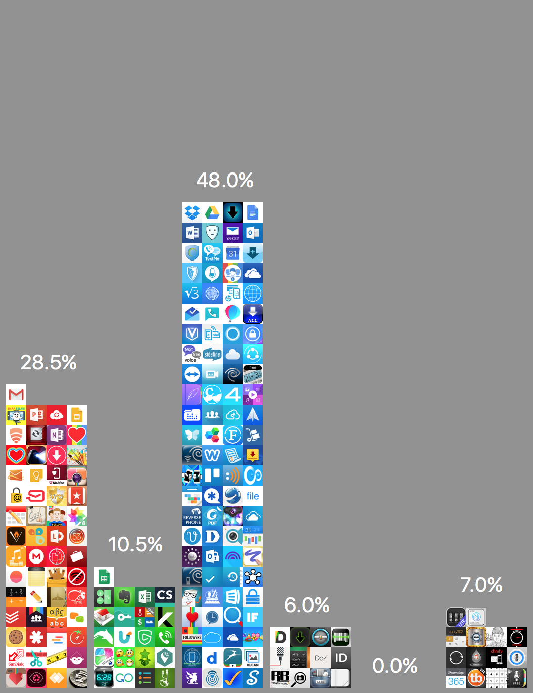
Free Apps in Weather (left) and Productivity Charts (right)#
Blue is the next most common color for app icons after red. Weather app icons are mostly blue (understandably). Productivity apps also tends to be blue rather than red.
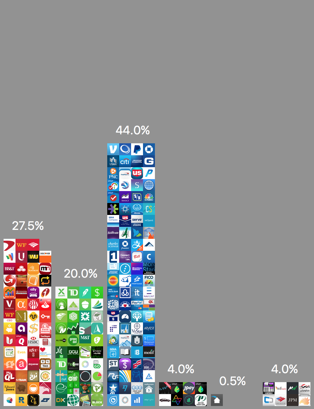

Free Apps in Finance (left) and Navigation (right)#
Finance and Navigation has the greatest proportion of green icons among all categories. But even that is low at 20.0% and 18.5% for Finance and Navigation respectively.

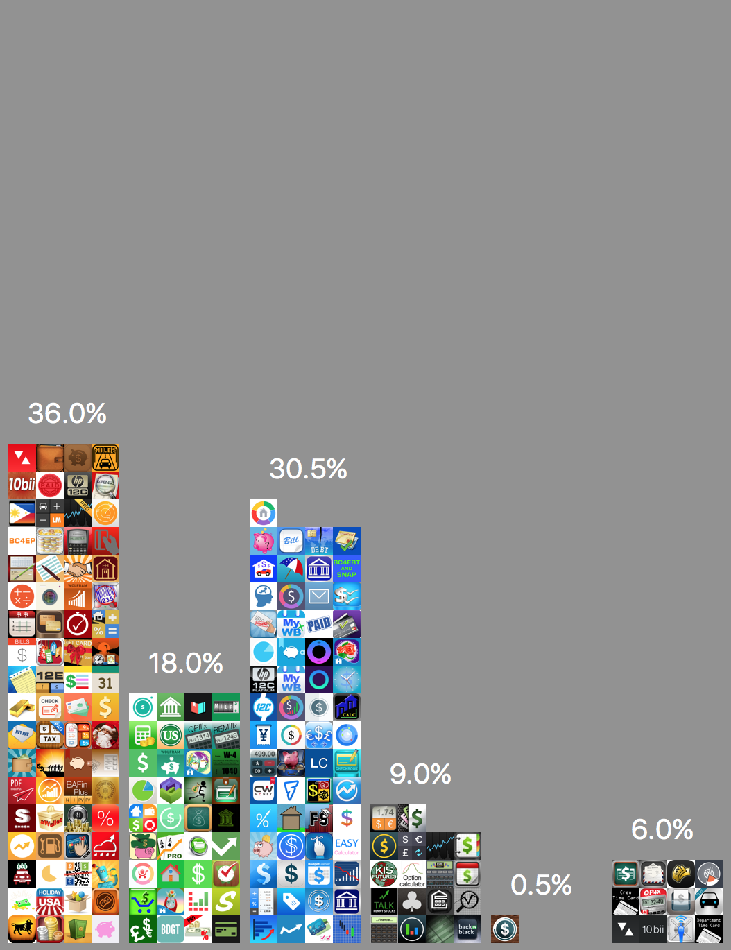
Free (left) vs Paid (right) Apps in Finance#
Free finance apps tends to be blue, but paid finance apps are most likely red than blue.
Similarly for News apps. Free Reference apps tends to be red but paid Reference apps are roughly split between red and blue. Free utilities are more likely red than blue, but paid utilities are more likely blue than red.
Green app icons are the least common.
Conclusion
This isn’t a rigorous analysis, but it looks like if you want your app icons to stand out, the data says: pick green/blue for Food & Drink, red/green for Weather and so forth.
Self-Promotion
Do you design iOS app icons?
I wrote about the story behind Iconica+ previously. Check out my iOS app Iconica+ that helps you test your icons quickly and easily across different backgrounds in the home screen:
Do you write iOS apps?
I write a short iOS app development nugget every Friday/Saturday. It’s short, and usually something you can read in a few minutes and improve your skills at iOS app development. Check out the iOS Dev Nuggets archives or subscribe here.