Iconica+ App for iOS — Compare iOS Logos

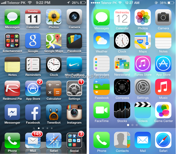
2 years ago, many UI changes was introduced when iOS 7 was announced. One of the things that stood out was how the home screen was going to be changed — the icon language has obviously changed; the radius of the icon rounded corners, the background of the dock will have flat but frosted glass effect. I was just starting to explore RubyMotion at that time and thought of using it to build an app. The iOS 6 to iOS 7 transition presented an idea to me. There will be a period of time where app developers will build apps that run on both iOS 6 and 7 so their app icons have to cater for both versions and since iOS 7 is new, designers will have to experiment more to get their icon designs right. I decided to build an app that help designer do exactly that.
The goals are simple, to let designers:
- Get many variations of an app icon quickly onto their iPhone
- Visualize how the app icon variations look on the home screen
-
Set the icons on top of wallpapers of various colors and contrasts
-
Test App Icon Variations
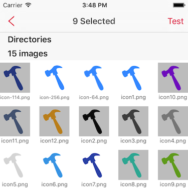
I decided to support Dropbox as it is commonly installed and uploading small files to Dropbox is fast. There is a one-time set up on the Iconica+ iOS app to connect to Dropbox. On OS X, the designer can create all the icon variations that they want to test, save it to a Dropbox folder and browse Dropbox in Iconica+ to pick out the icons to choose from. Iconica+ automatically adds a rounded corner to the icons. There is no OS X version of Iconica+ needed. Only the Dropbox client needs to be installed on OS X.

-
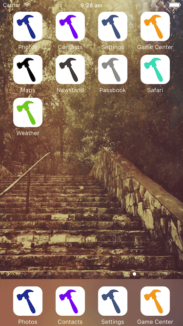
Visualize on the Home Screen
The icons are laid out on a simulated home screen, with the first 4 icons also appearing in the dock. I took care to match the margins used by the actual iOS home screen. (The original version of Iconica+ that worked for both iOS 6 and 7 gave designers a choice to switch between a simulated iOS 6 and iOS 7 home screen which has different rounding radius, dock and layout margins. This has been removed from the released version of the app.)

-
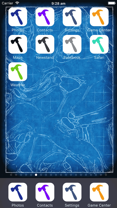
Different Types of Wallpapers
Swift left and right to switch between the included wallpapers to get a feel of how the icons look against wallpapers of different colors and contrast.

Iconica+ was rejected from the app store for various reasons. I worked with app store reviewers to get the app on the store. 2 years and 2 major iOS version later, Iconica+ is now available on the iOS app store. I hope you like it.
PS: Thanks to David Barnard (@drbarnard) for suggesting I push the app through app store review again a few months ago. I was already going to let it die.